Exploratory Data Analysis#
Table of Content#
The EDA Process put into context
Types of EDA
uni-/bi-/multi-variate
numerical vs. graphical
continuous vs. categorical data
Measures of central tendency / dispersion
Distribution functions / histograms / modality
Correlations
Special considerations for categorical / discrete variables
Summary / References
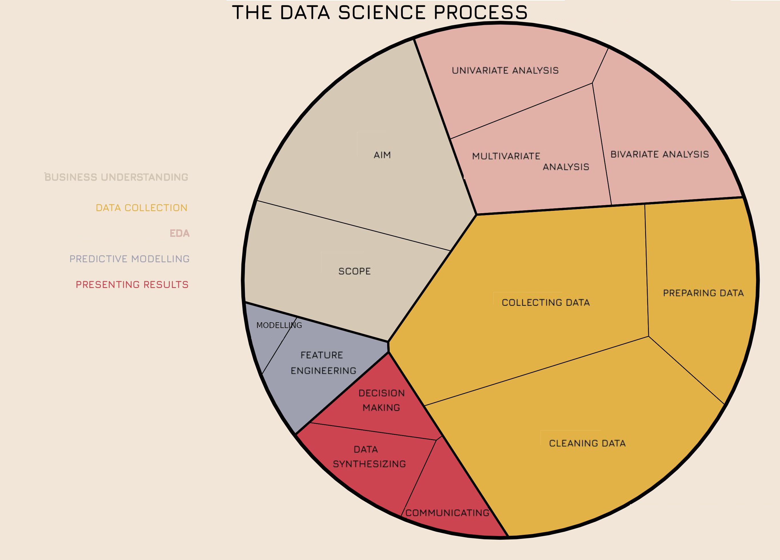
The EDA Process#
Research / Business Questions#
Those questions that arise from a researcher guessing about reality (data). They are written in the form of a question.
Examples:
Which factors can increase ice cream sales?
Can we predict skin cancer using photographs of the melanome?
How does the material composition of a bridge affect its durability?
Hypothesis Generation#
Hypotheses are assumptions or educated guesses we make about the data, using our domain knowledge.
You can form a hypothesis in the form of “if/then” or “the more the”.
A Hypothesis is formed as a measurable (operationisable) statement you can validate by looking at data.
A research question can have multiple hypotheses attached to it.
Examples:
If the sun is shining then ice cream sales increase.
The larger the melanoma, the greater the risk that it is malignant.
The cheaper the material composition the shorter its durability.
Hypothesis Generation != Hypothesis testing#
The process is an educated guess, the hypothesis could still come out to be true or false after EDA and hypothesis testing (is the conclusion random or not?)
Where does EDA belong in the bigger picture?#
Black cats and domain experts#
→ Talk to domain experts or become one.

What is EDA and why do we do it?#
What is EDA?#
→ Detective work
EDA is the process of summarizing and visualising important characteristics of the data in order to gain insights.
It’s an approach/process not a set of techniques.
Tools:
Any method of looking at data that does not include formal statistical modelling and inference
Visualisation
Confirm the expected or show the unexpected!
Goals and Benefits#
Understand each variable
Get insight into relationships between the variables
Draw valid conclusions
Checking assumptions
Aid in decision making and planning
Help in causal analysis
→ To build intuition about the data and gain insights
→ To generate and corroborate or reject hypotheses
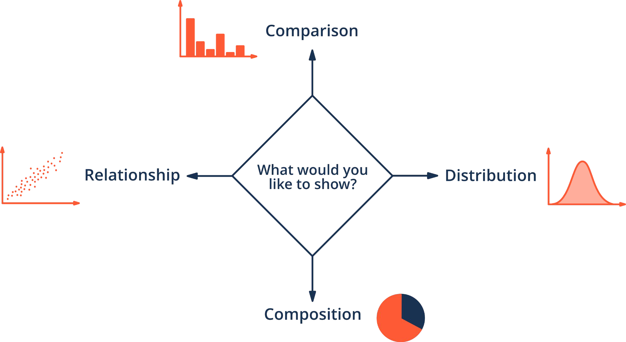
Types of EDA#
Univariate or multivariate
Graphical or non-graphical
Dealing with both categorical and numerical data
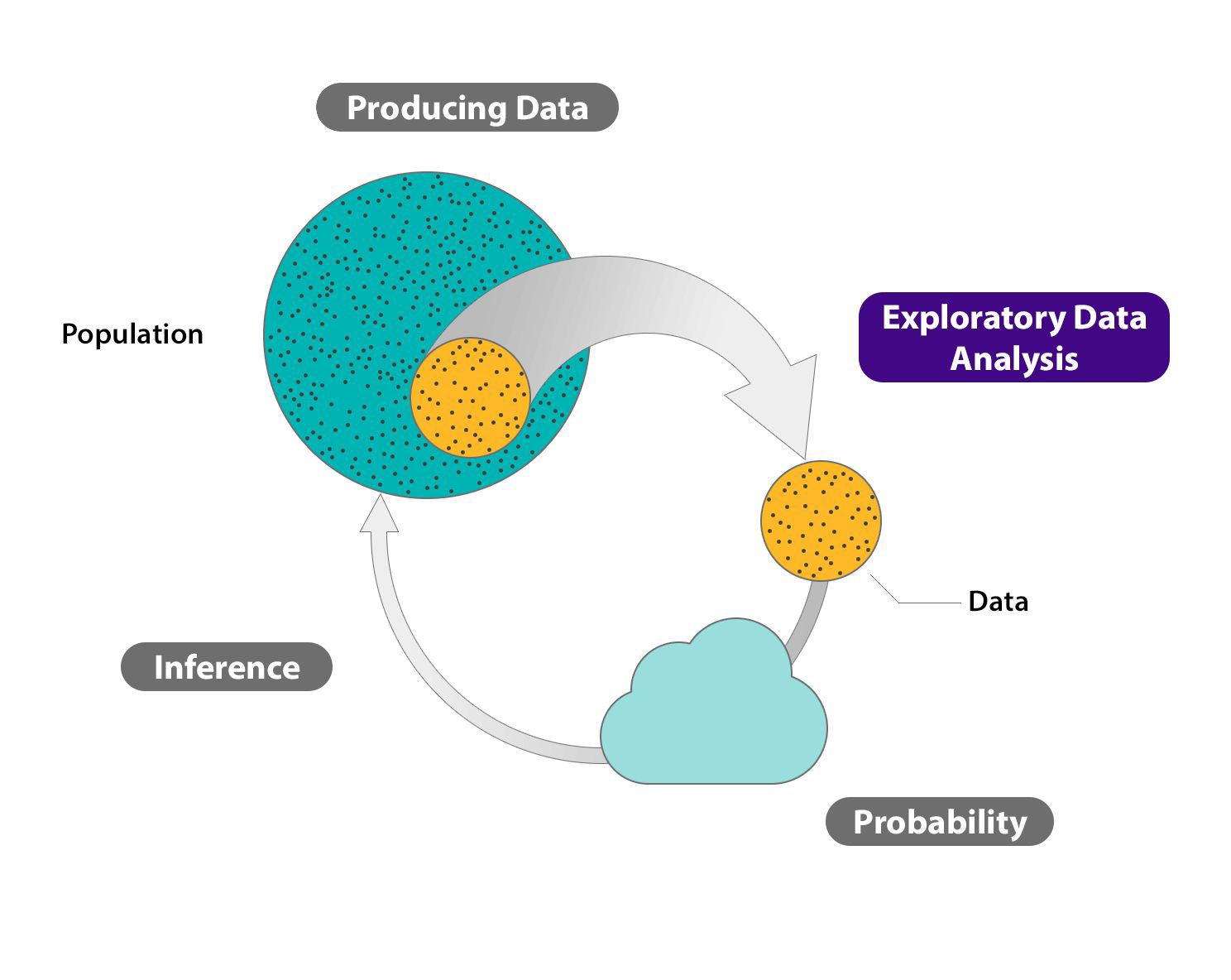
Estimates#
We can rarely have money/resources to measure everything
So we will have samples of the population which we hope to be representative of the whole population
The more data we have the more confident we are in the estimates
Ideally: the results drawn from our experiments are reproducible
In Data Science most metrics omit the “estimate” word… nevertheless mostly all metrics we use are estimates.
Univariate vs. Multivariate Analysis#
Univariate Analysis:
Analysis of a single variable (often called feature)
Characterises data by focusing on distribution, central tendency, dispertion, etc
Represents information numerically and visually
Multivariate Analysis:
Simultaneous analysis of multiple variables
Examines how changes in one variable are associated with changes in others
Characterises dependence by a numerical coefficient
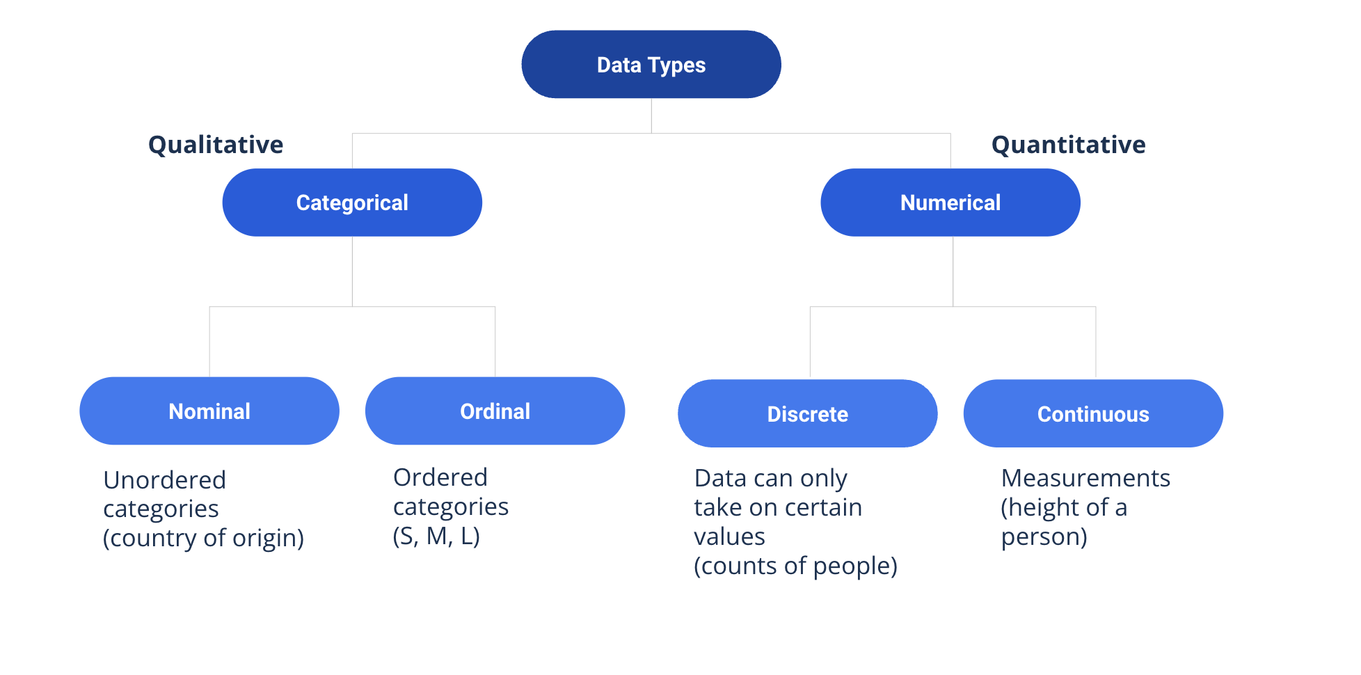
Data Types#
Univariate EDA#
Describing Central Tendency#
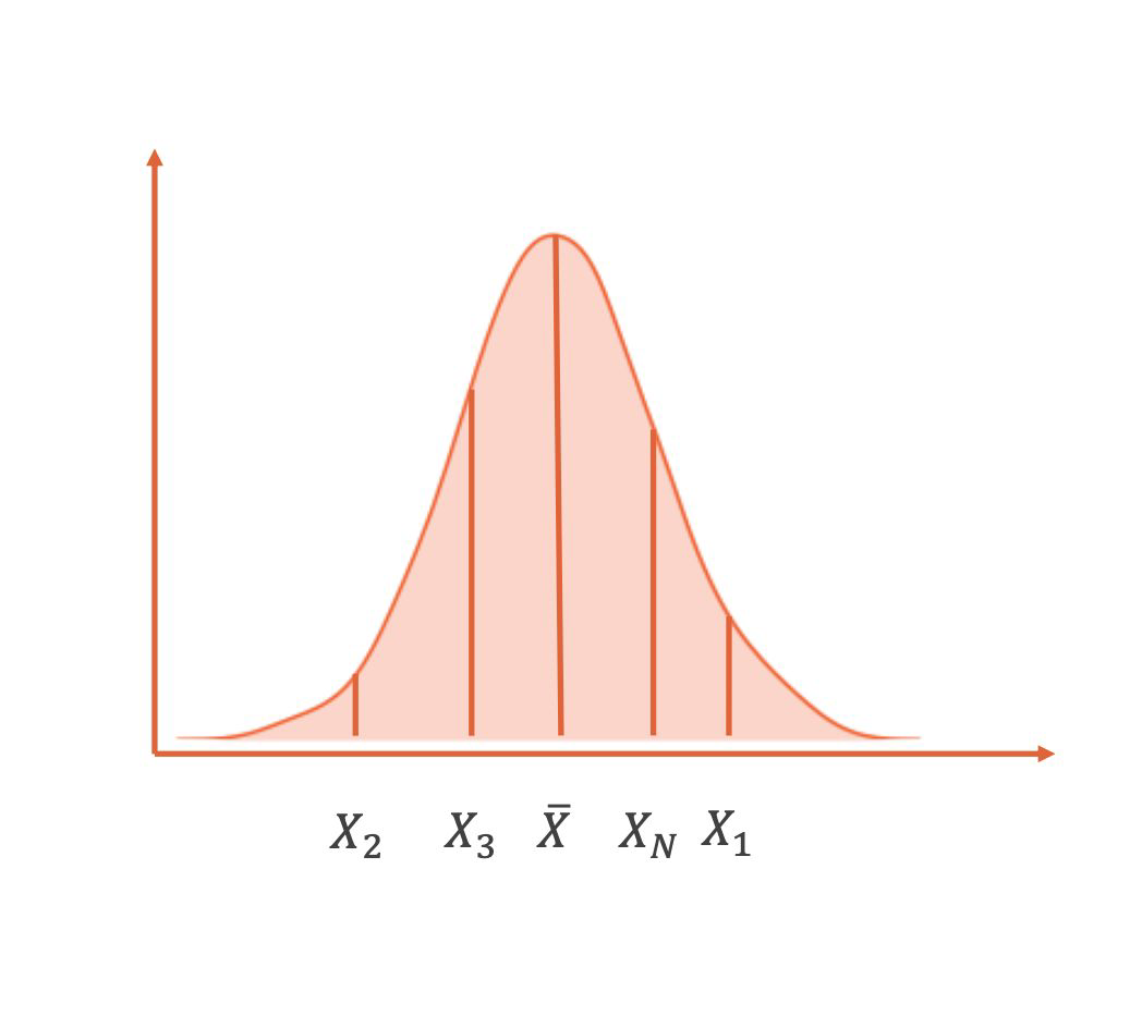
Mean#
sum of data points divided by number of data points
often used as default
sensitive to extreme values
What is the mean in this example?
id |
y |
|---|---|
1 |
2 |
2 |
6 |
3 |
6 |
4 |
8 |
5 |
10 |
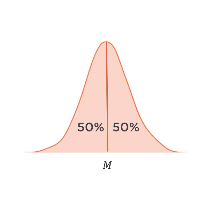
Median#
value in the middle of a data series ordered by size
more robust against extreme values but computationally more expensive since values need to be sorted
What is the median in this example?
id |
y |
|---|---|
1 |
2 |
2 |
6 |
3 |
6 |
4 |
8 |
5 |
10 |
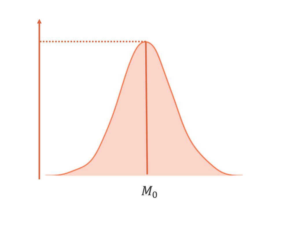
Mode#
most frequent values
not necessarily unique
mostly used for categorical data
What is the mode in this example?
id |
y |
|---|---|
1 |
2 |
2 |
6 |
3 |
6 |
4 |
8 |
5 |
10 |
Describing the Spread#
Range#
difference between largest and smallest value
measures the spread of the data
sensitive to outliers
Quantiles#
quantiles split sorted data into parts with equal amount of observations
quartiles: splits data into 4 parts
deciles: splits data into 10 parts
percentiles: splits data into 100 parts
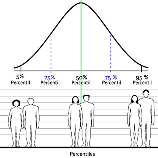
Notes: The position of the percentiles are not equidistant (and depend on the distribution)
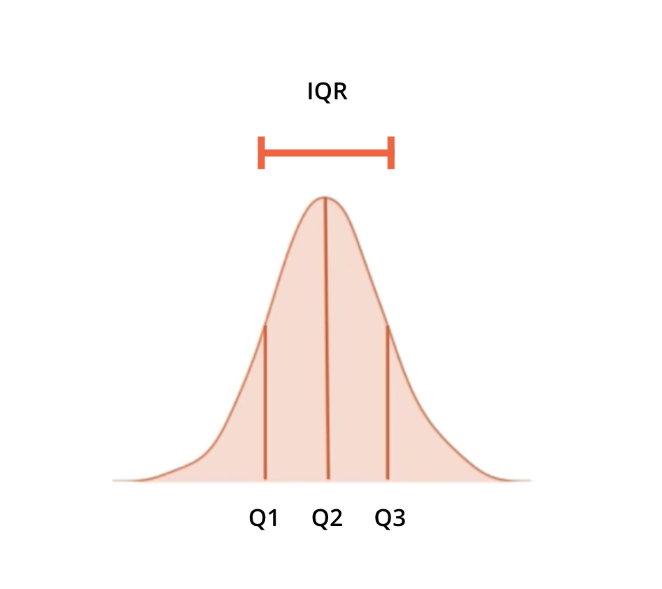
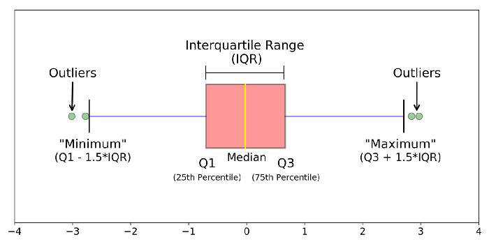
Interquartile Range (IQR)#
width of interval that contains the middle 50% of the data
interval between the 25th and 75th percentile
interval between 1st and 3rd quartile
robust to outliers
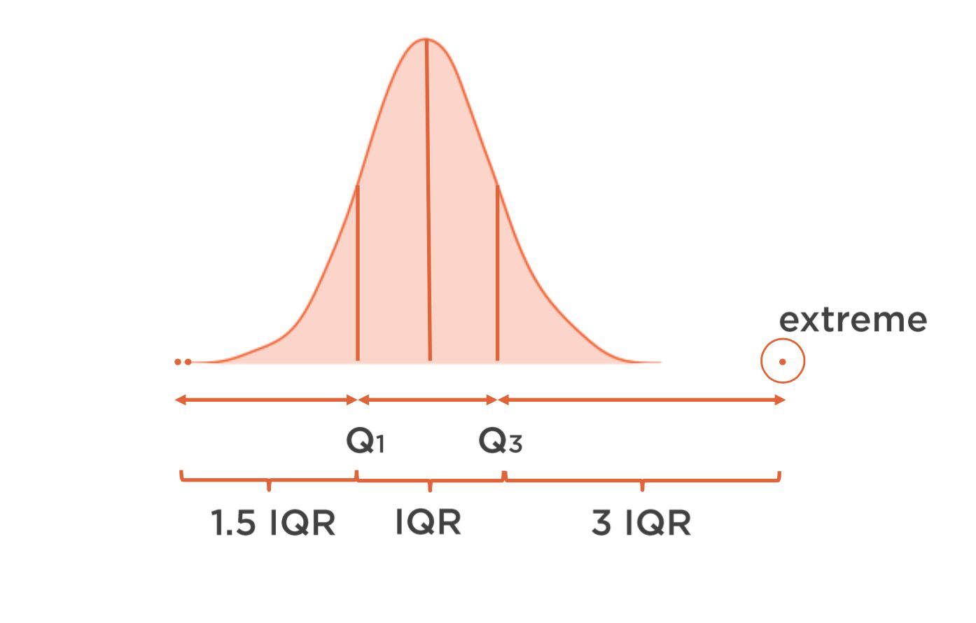
Outliers#
No generally recognized formal definition for outlier
Values outside of the areas of a distribution that would commonly occur
If an outlier is good or bad depends on the data problem. For example for anomaly detection you want to keep outliers.
Box Plots#
Variance & Standard Deviation#
Variance
average squared difference of the values from the mean: \( \sigma_{sample} = \frac{1}{n-1}\sum_i{(x_i-\bar{x})^2}\)
Standard deviation
square root of variance: \(SD = \sqrt{\sigma}\)
standard difference between each data point and the mean
has the same unit as the original data
Both are not robust to outliers.
Describing the Distribution#
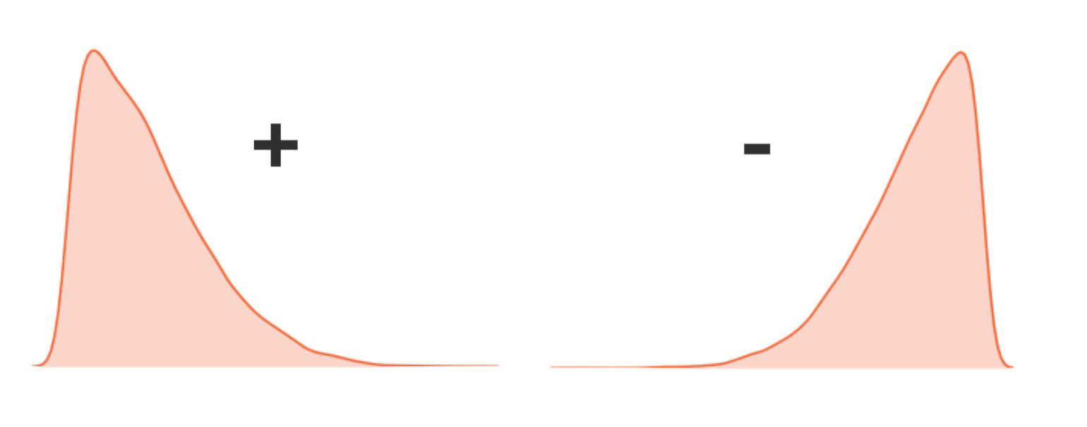
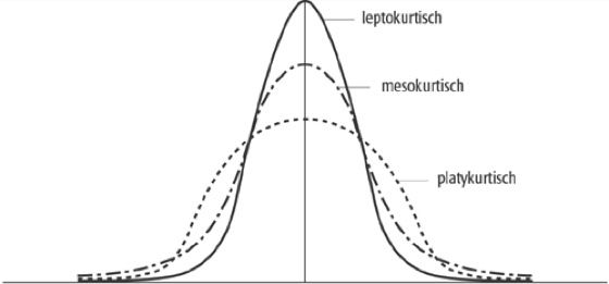
Skewness & Kurtosis#
Skewness
degree of asymmetry of the distribution of the data
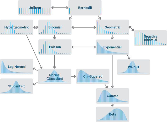
Data Distributions#
Uniform
all events have same frequency, e.g. outcome of a dice rollBernoulli
two possible outcomes, e.g. a coin tossBinomial
“discrete version” of normal distribution, e.g. 100 x two coins: likelihood of a certain number of only headsNormal
most continuous real-valued variables in nature follow this distributionPoisson
events occurring at random points of time and space - the number of events VideoExponential
the interval between events
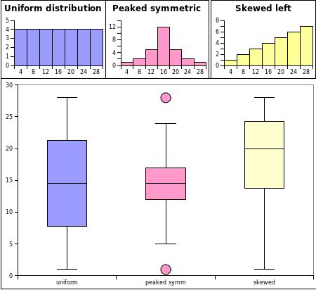
Visualising Data Distributions with Histograms#
Box Plots#
What do we see here?
Binwidth#
Binwidth matters!
Same data with bin width = 5, 2, 1
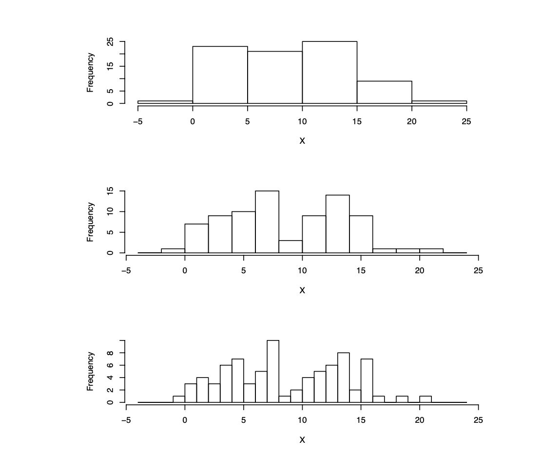
Rule of thumb: Take the square root of the sample size as the number of bins for a first guess (trial and error).
How to choose number of bins#
Rule of thumb: Take the square root of the sample size as the number of bins for a first guess (trial and error).
Consider:
too large bins → we lose details or end up having only one bin
too small → we have too much detail or end up with one bin per observation
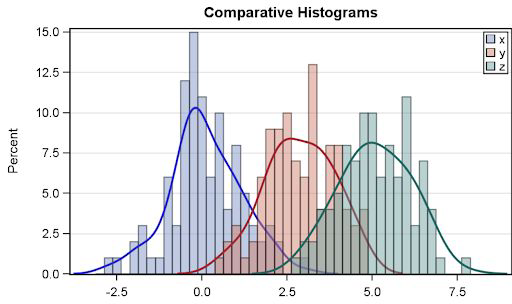
Comparing Data Distributions with Histograms#
Good for looking at residuals (variance)
Works best for comparing max 3-4 groups
You can use so-called kernel density estimates (KDE) to plot it continuously
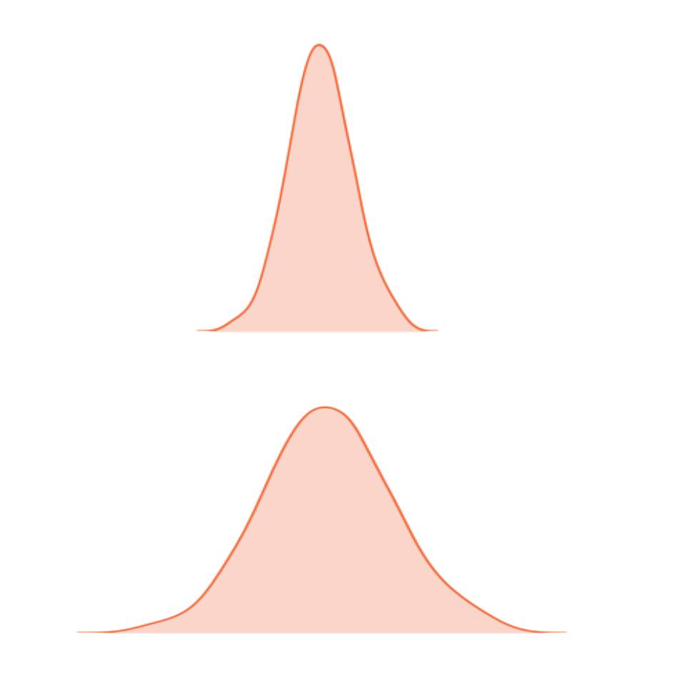
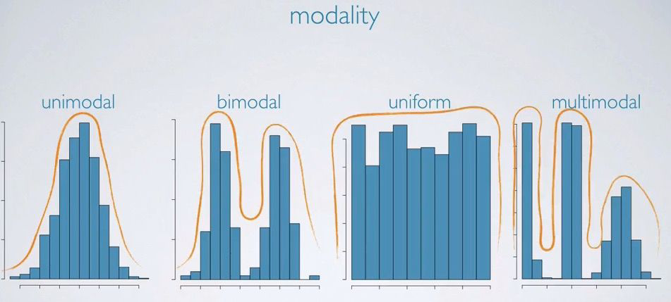
Modality#
Plot a histogram and look at the number of peaks in the distribution
Data Summaries#
Central tendency |
Spread |
Modality |
Shape |
Outliers |
|---|---|---|---|---|
mean |
range |
unimodal |
skewness |
|
median |
interquartile range |
bimodal |
kurtosis |
|
mode |
variance |
multimodal |
||
quantiles |
standard deviation |
uniform |
Multivariate EDA#
Numerical Data#
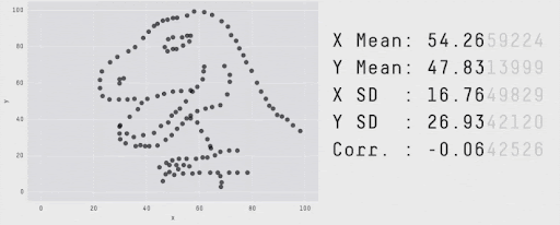
Scatter Plot#
Used to visualise relationship between two numeric variables
Also called correlation plots
Can encode multiple dimensions by color and size
It visually answers the question:
→ “How are these variables related?”
→ “When variable X grows, what happens to variable Y? With which intensity?”
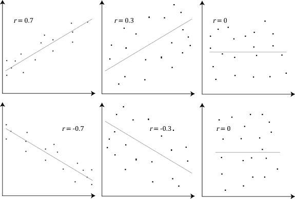
Pearson correlation coefficient / Pearson’s r#
Measures the linear relationship between two variables
Ranges between -1 and 1
→ close to 1: strong positive linear relationship
→ around 0: no linear relationship
→ close to -1: strong negative linear relationship
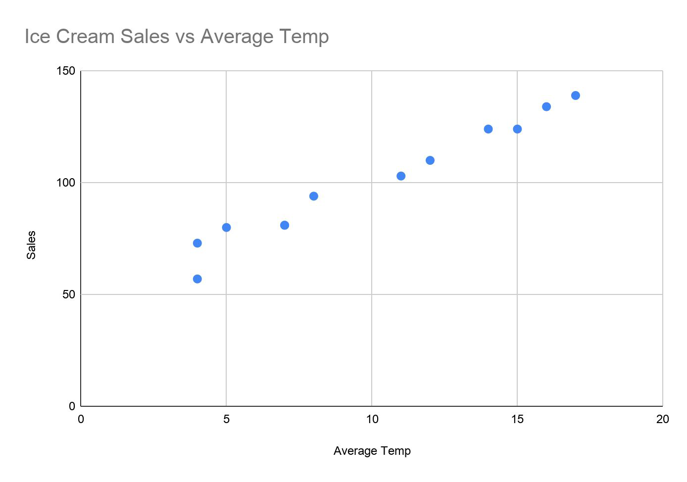
The ice cream example#
Month |
Average Temp |
Sales |
|---|---|---|
January |
4 |
73 |
February |
4 |
57 |
March |
7 |
81 |
April |
8 |
94 |
May |
12 |
110 |
June |
15 |
124 |
July |
16 |
134 |
August |
17 |
139 |
September |
14 |
124 |
October |
11 |
103 |
November |
7 |
81 |
December |
5 |
80 |
The ice cream example#
r = 0.983
A correlation analysis may establish a linear relationship but does not allow us to use it to predict the value of a variable given another. Regression analysis allows us to this and more.
Spearman rank correlation coefficient - Spearman’s ρ#
Measure of rank correlation, it is based on the rank of the values vs. the raw data
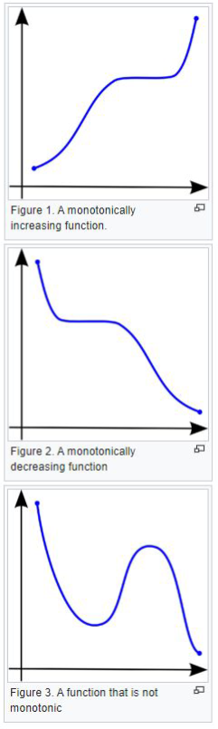
Represents the strength of a monotonic relationship
Monotonic function:
→ increasing: as X increases Y never decreases
→ decreasing: as X increases Y never increases
Consideration about correlation#
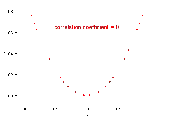
If two variables are independent, their correlation is 0, but a correlation of 0 does not imply that two variables are independent!
The correlation coefficients cannot replace visual examination of data.
The presence of correlation is not enough to infer causation!
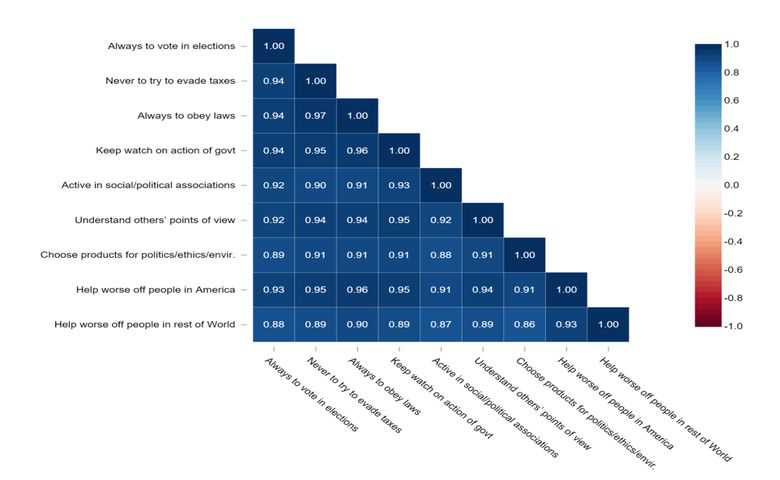
Bivariate and Multivariate Analysis#
Looking at all possible combinations of features:
for 9 features bivariate would mean 36 combinations: \(\sum_{i=1}^{8} i\)
How do we reduce the exploration space or focus on interesting combinations?
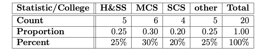
Special consideration of discrete / categorical data#
mode
frequency tables: number of times a value occurs
expected values: weighted mean when categories can be associated with numerical value
Frequency tables#
Tabulation of the frequencies
Show the range of values and frequency of occurrence
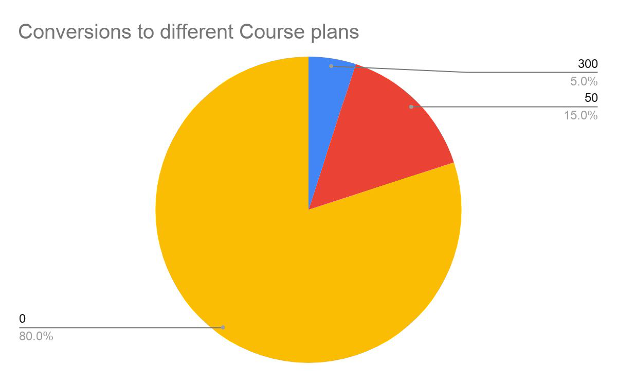
Expected values#
weighted mean
Example: Offers for different course plans for financial purposes we can sum this up in a single “expected value,” which is a form of weighted mean, in which the weights are probabilities.
\(EV = 0.05*300 + 0.15*50 + 0.80*0 = 22.5\)
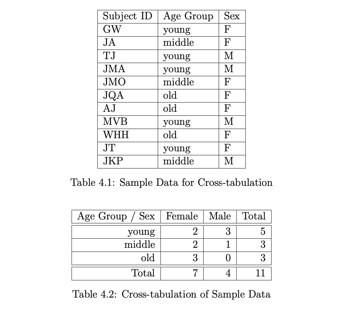
Cross-tabulation#
Summary / Outlook#
EDA is like a detective’s investigation to
understand the data
identify patterns
Why do we want to know our data? Because we want to find out
how to answer our research / business question
whether the data is suitable / sufficient
how to answer the research questions with the existing data
how to phrase/refine our hypotheses
Summaries vs. Details…#
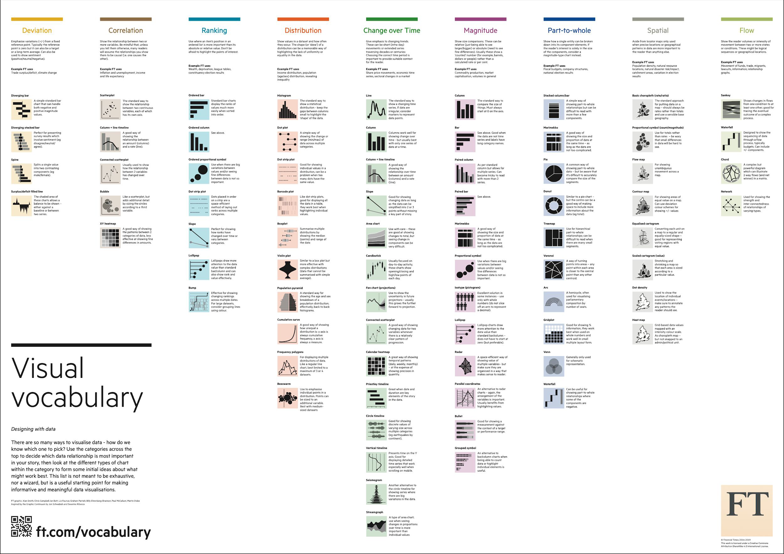
Techniques Map#
Visual Vocabulary#
References#
Introduction to Data Science Lecture 6 Exploratory Data Analysis
Exploratory Data Analysis - John W. Tukey
Practical Statistics for Data Science - Peter Bruce & Andrew Bruce
Econometric Methods with Applications in Business and Economics - Christiaan Heij, Paul de Boer, Philip Hans Franses, Teun Kloek, Herman K. van Dijk
http://www.sumsar.net/blog/2014/03/oldies-but-goldies-statistical-graphics-books
Clearly explained pearson vs. spearman correlation coefficient
https://extremepresentation.typepad.com/files/choosing-a-good-chart-09.pdf