Gestalt Laws Principles and Visualisation#
Gestalt Principles of Grouping#
The whole is other than the sum of the parts.
Kurt Koffka

What are they and why do they matter?#
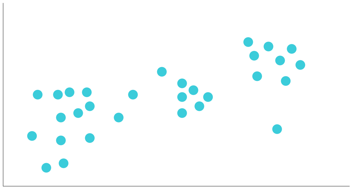
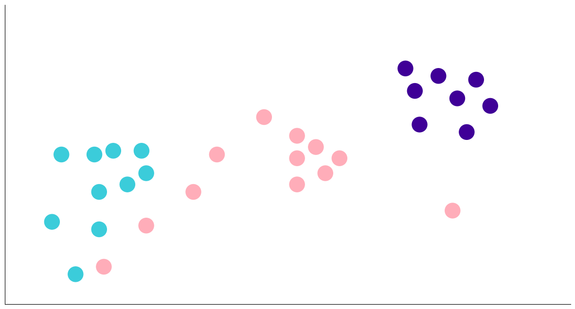
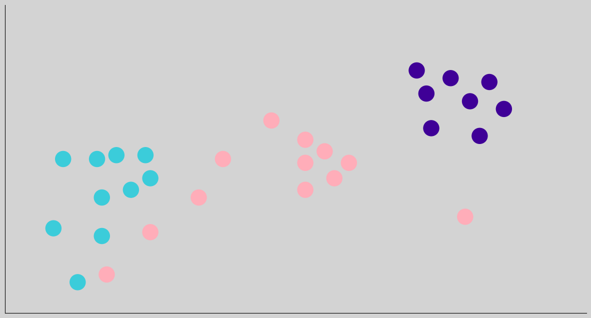
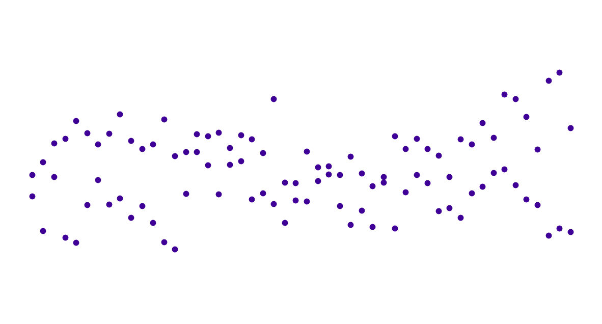
Proximity#
plot_points(array1a, array2a)

plot_points(array1b, array2b)

plot_points(array1a, array2a)
plot_points(array1_groups, array2_groups)

plot_scatter(x_scatter, y_scatter)
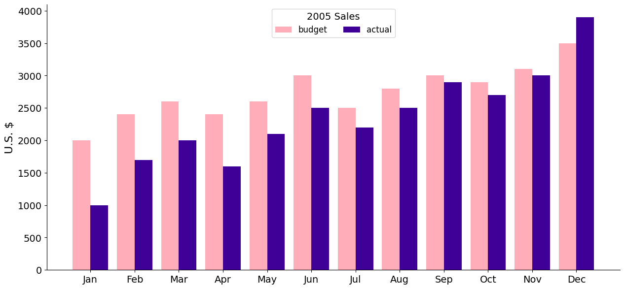
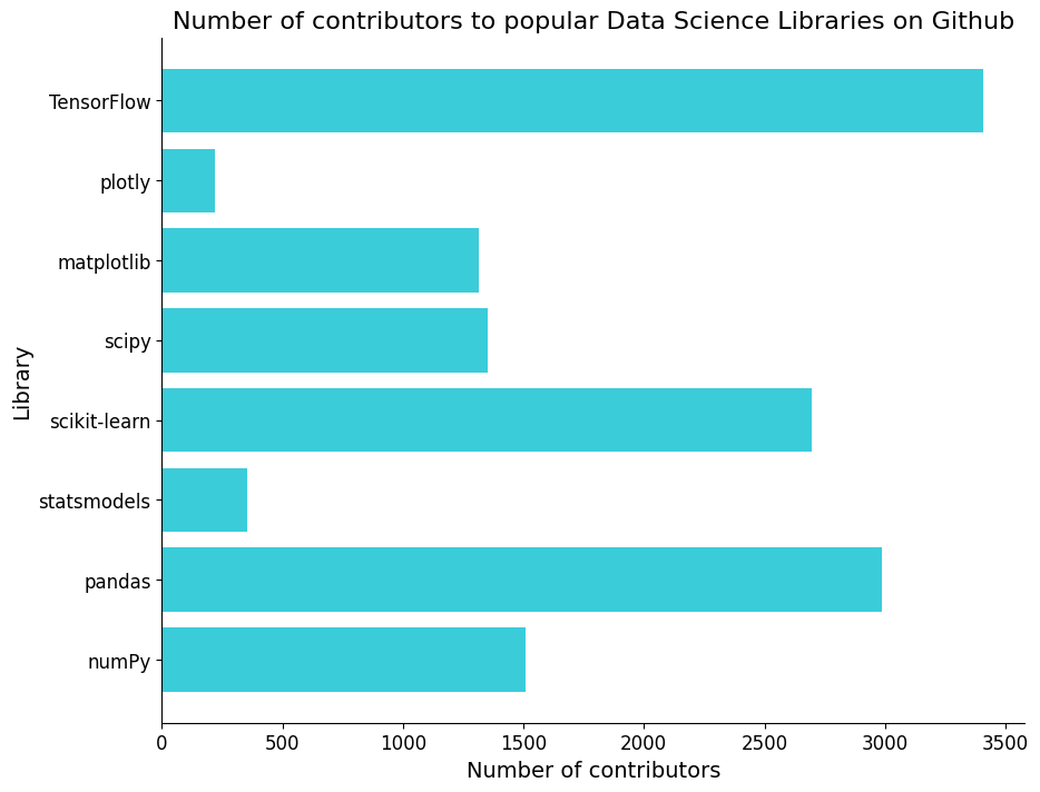
sales_plot(barplot=True)
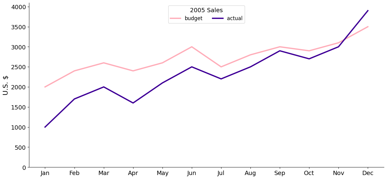
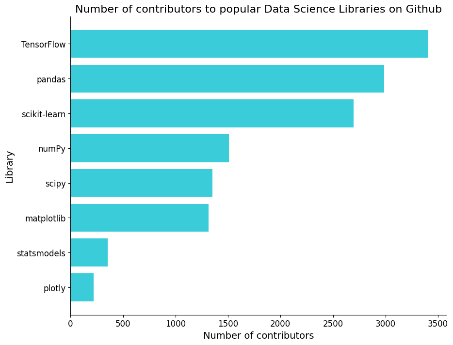
sales_plot(barplot=False)
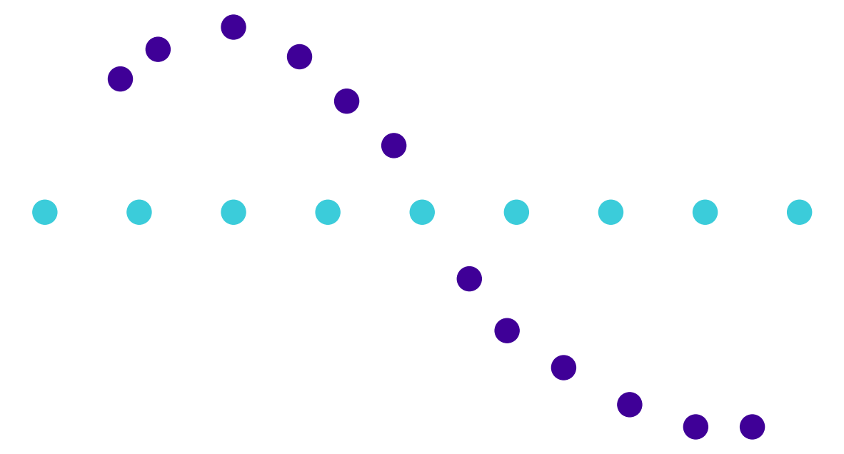
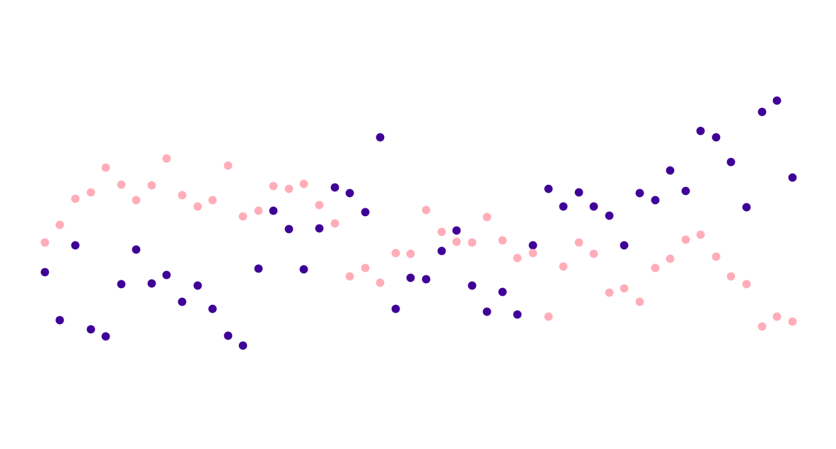
Similarity#
plot_points(array1a, array2a)
plot_points(array1a, array2a, labels_a)

plot_points(array1a, array2a, labels_a, squares=True)

plot_scatter(x_scatter, y_scatter)
plot_scatter(x_scatter, y_scatter, labels=labels_a)

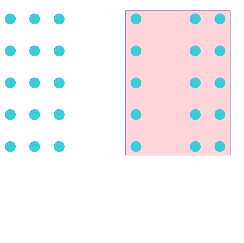
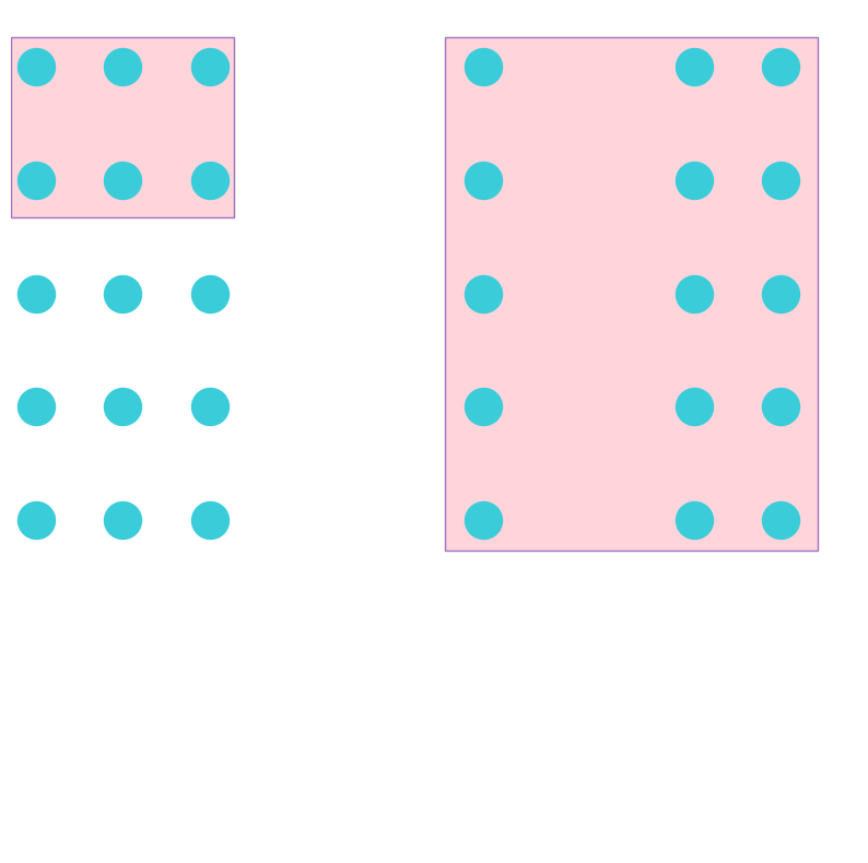
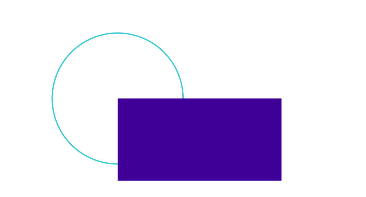
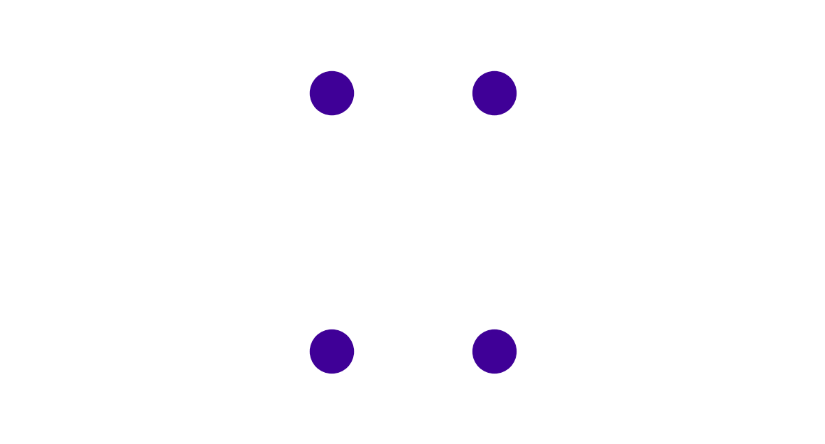
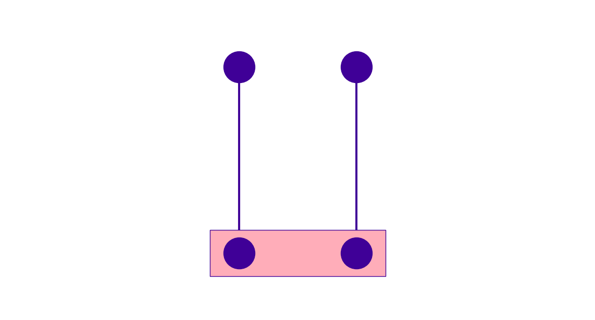
Enclosure#
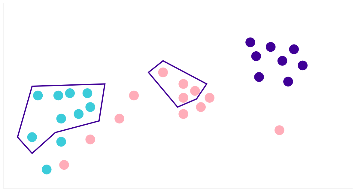
Closure#


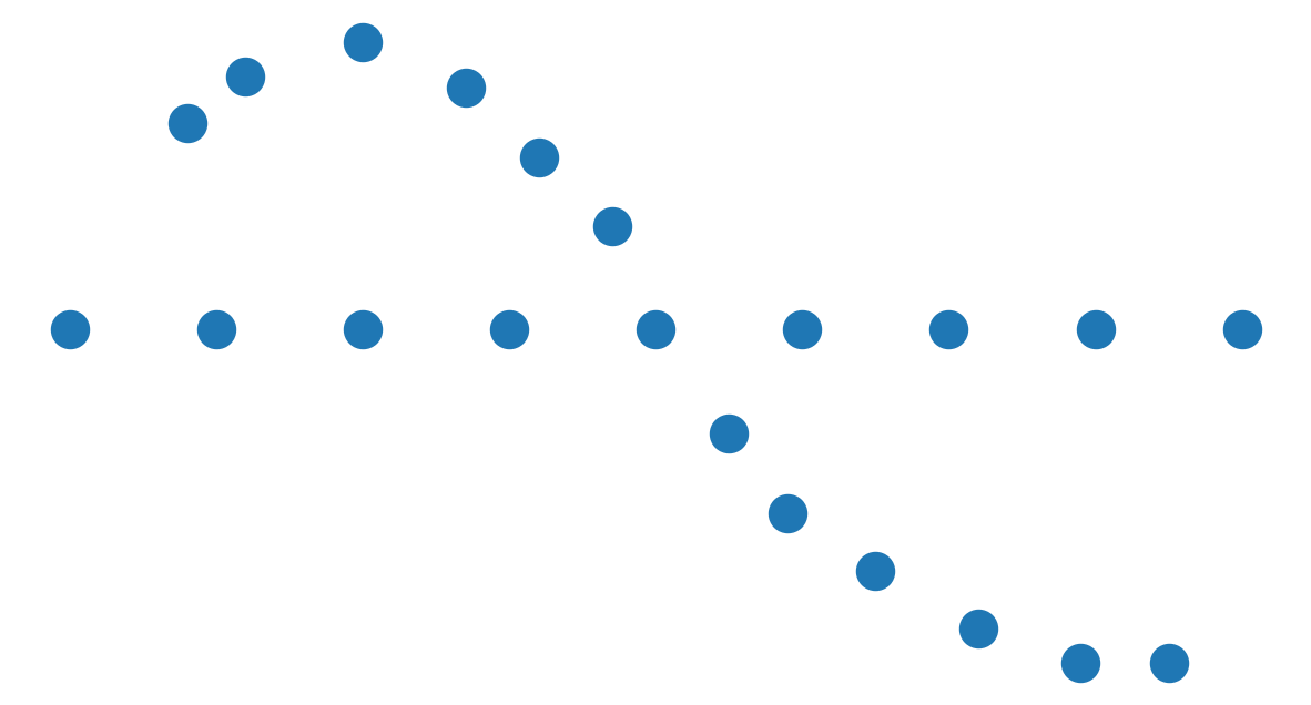
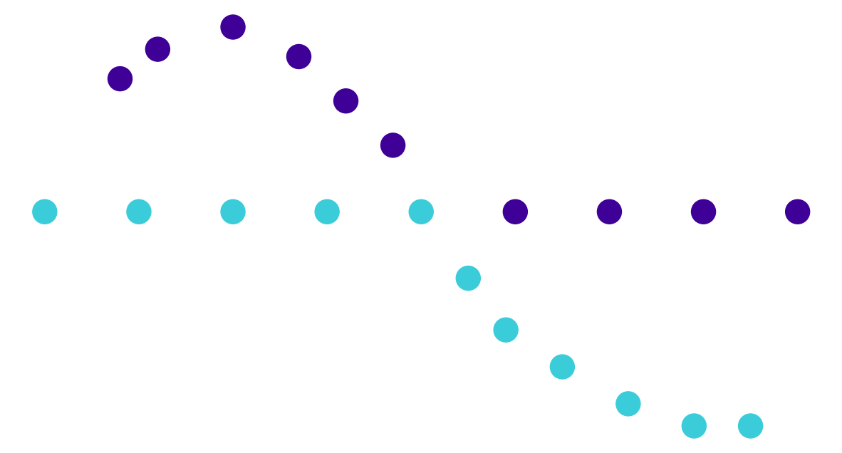
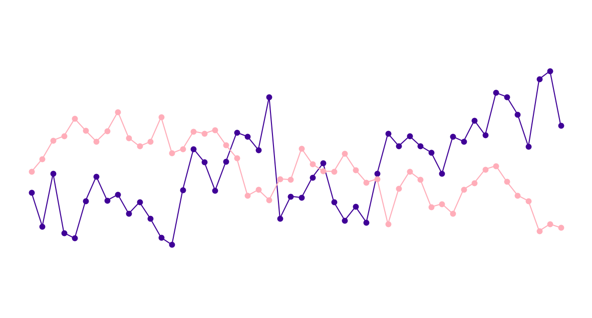
Continuity#
Connection#


So… that’s it?#
Pretty much…#
Similarity
Enclosure
Closure
Continuity
Connection
Break#

Best practices in Explanatory Data Visualization#
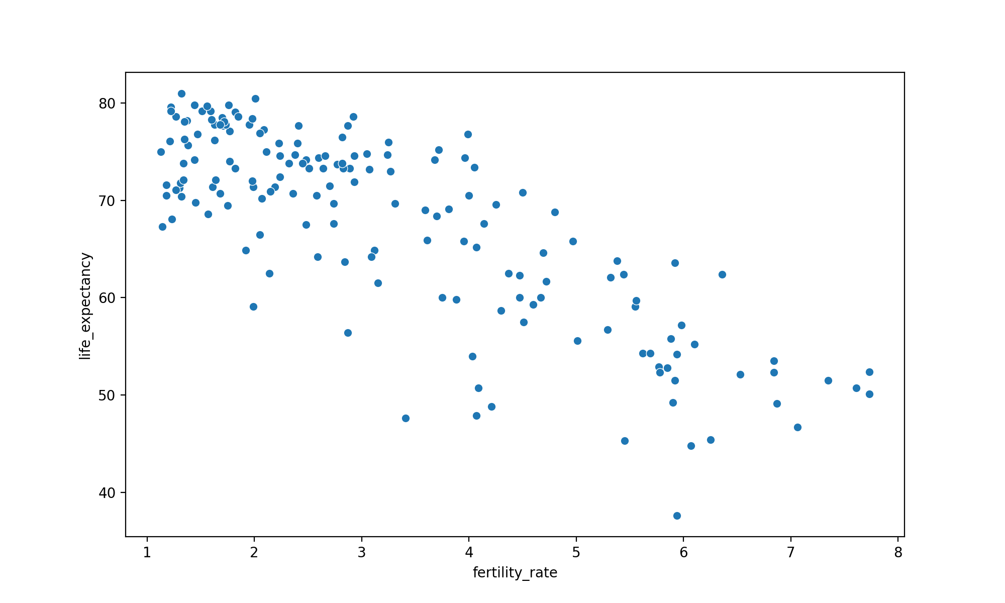
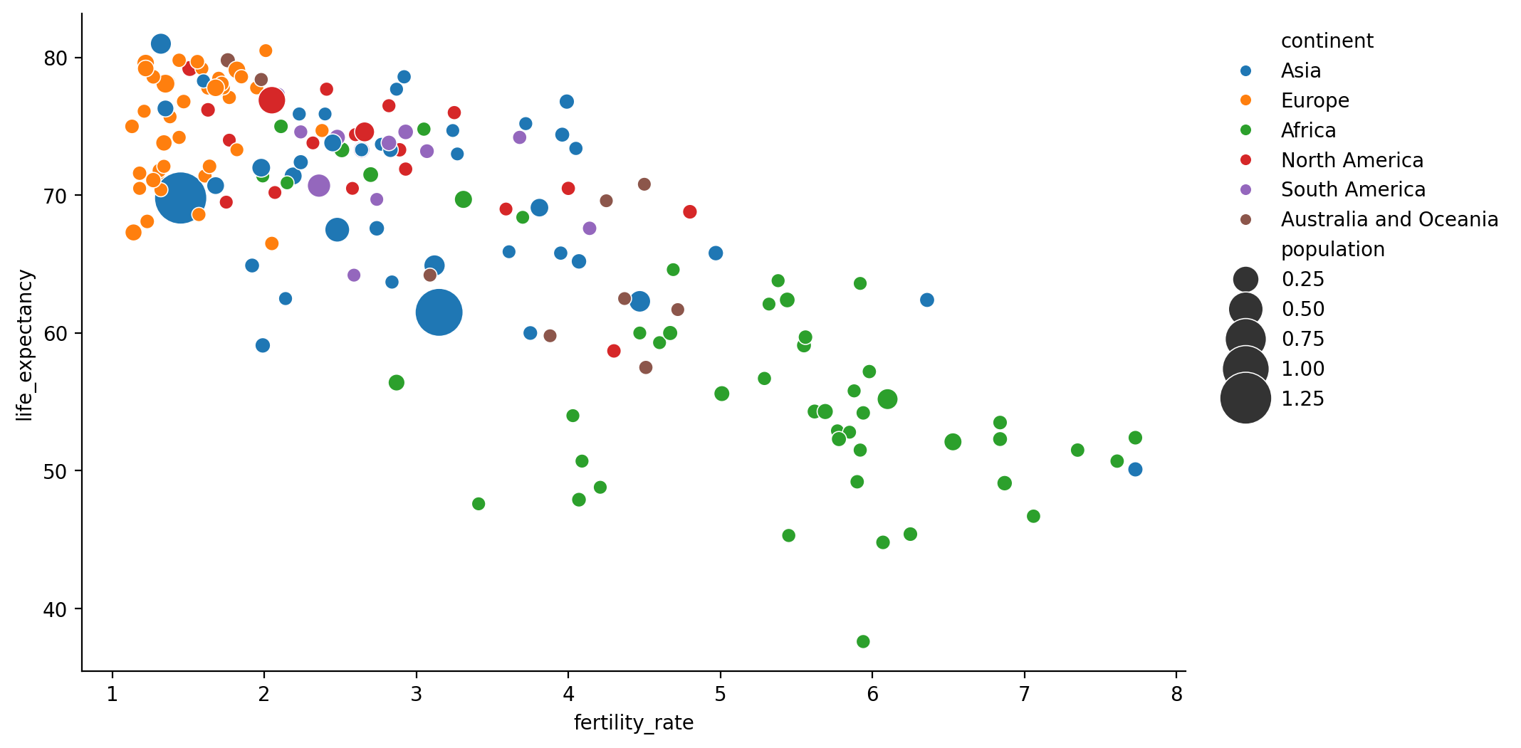
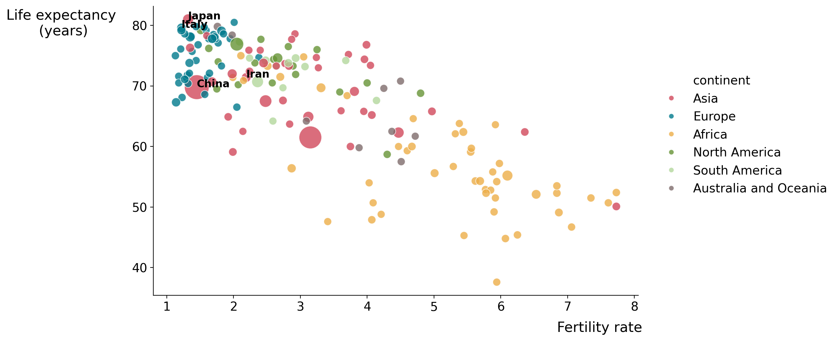
Make a scatterplot with Fertility Rate vs Life Expectancy#
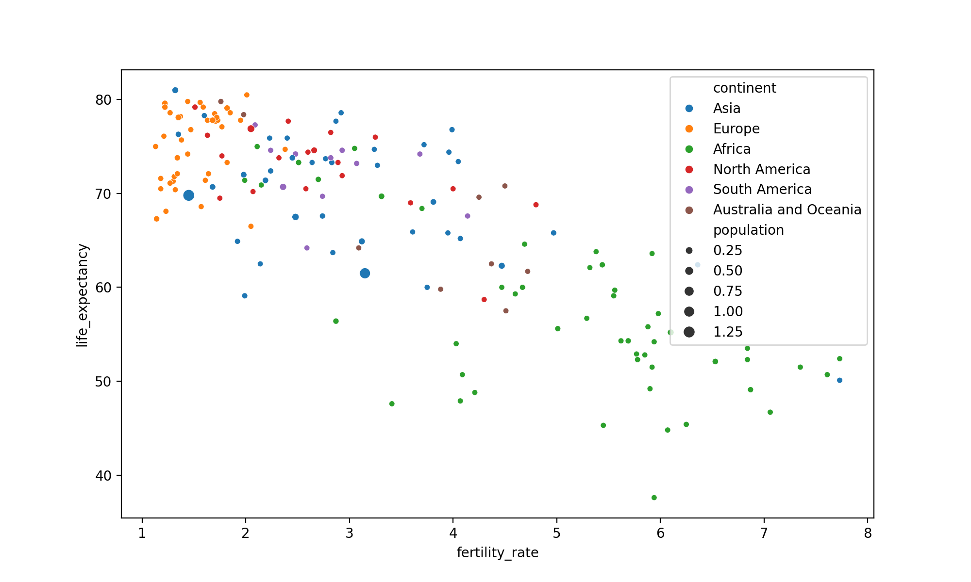
Add Extra Dimensions#
Color markers by continent
Size markers by population
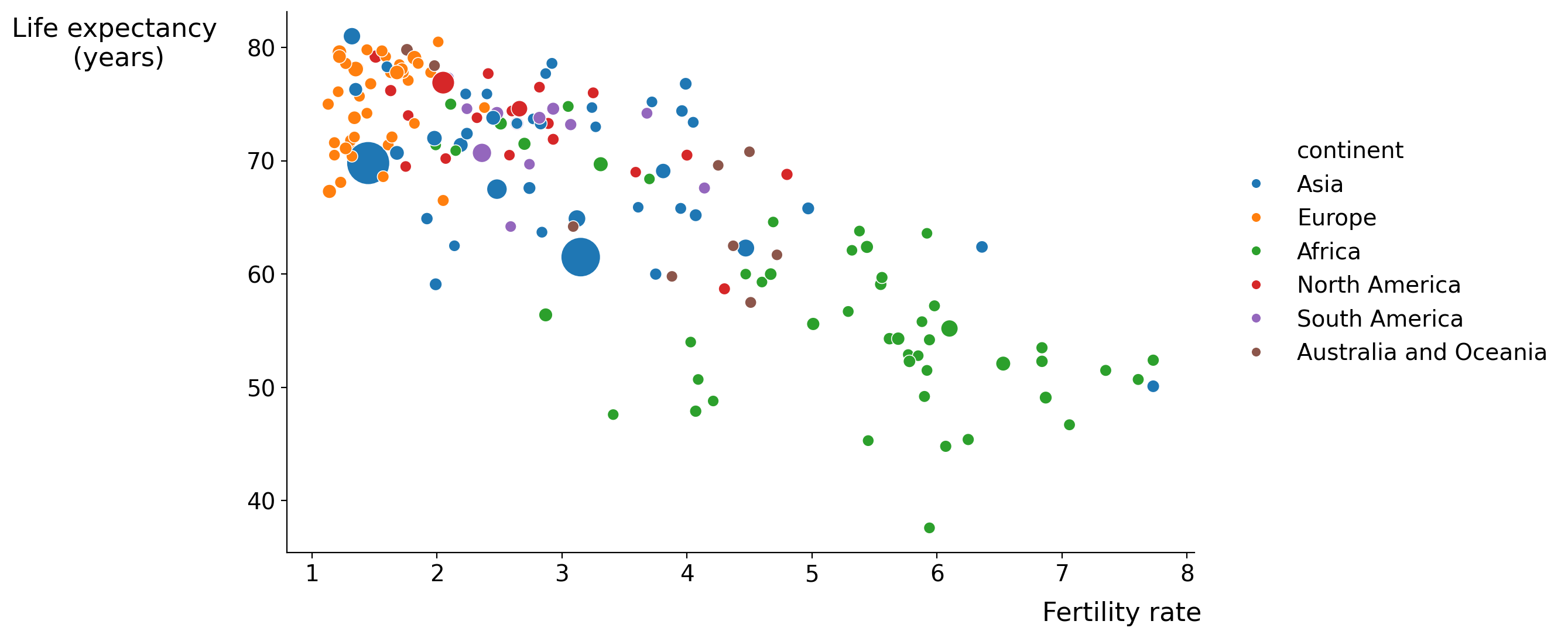
BEST PRACTICE: SIMPLIFY#
Make it legible
Eliminate clutter: get rid of elements that don’t aid to the understanding of the message (chart junk)
Make it legible#
Move the legend outside#
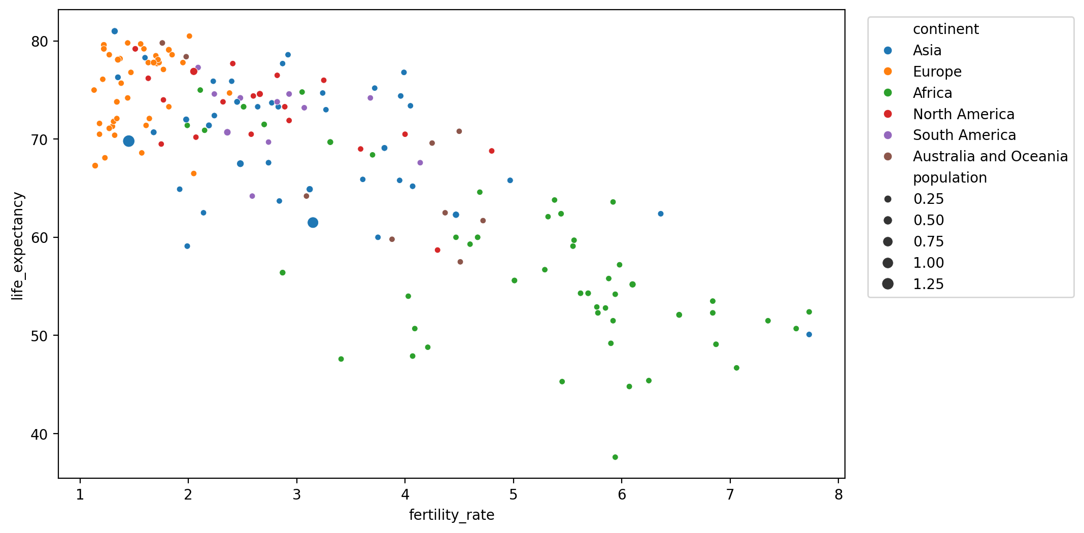
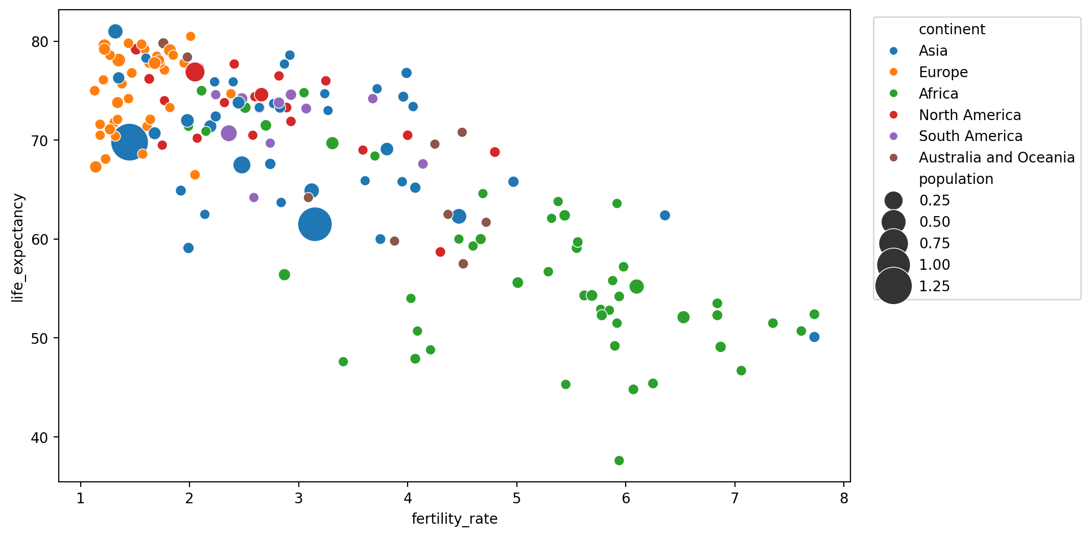
Adjust marker sizes to make differences visible#
Eliminate clutter#
Get rid of rectangle box and spines#
Improve legend#
Don’t show the population part
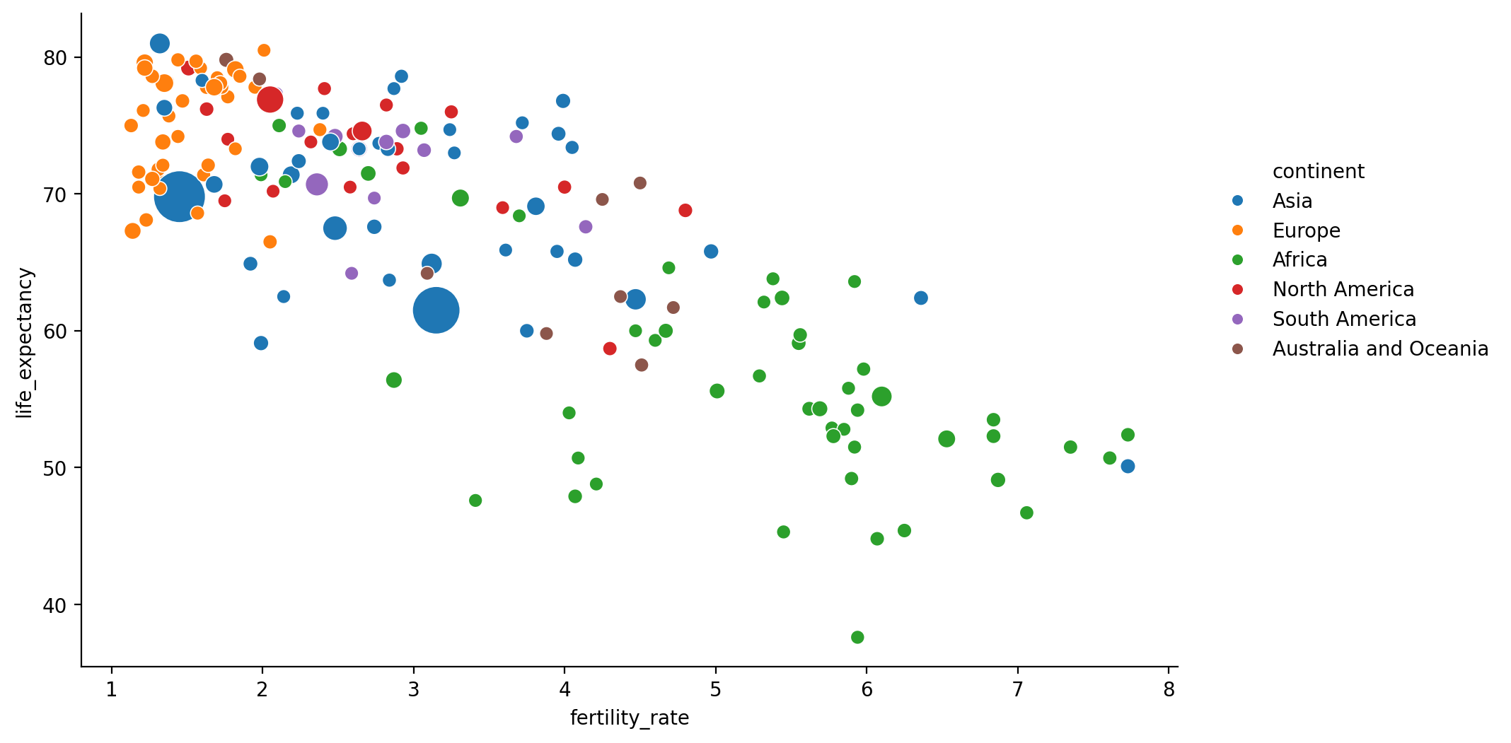
Adjust ticks + label text size#
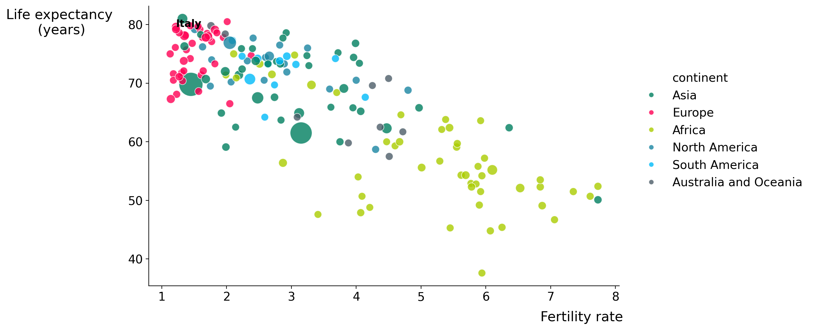
BEST PRACTICE: DRAW ATTENTION to your important points#
Things to know:
Which are my important points?
What is my message?
What do I want to show?
Things to do:
Emphasize your foreground data
De-emphsize background data
“I want to see how Italy is doing compared to other countries”
Add Labels to Countries of interest#

BEST PRACTICE: USE COLOR WITH INTENTION#
The most important color in Data Visualization is grey!
The standard categorical
seabornpalettes are great: https://seaborn.pydata.org/tutorial/color_palettes.htmlIn case you want to choose your own? [Q: When is this the case?]
Improve original palete#
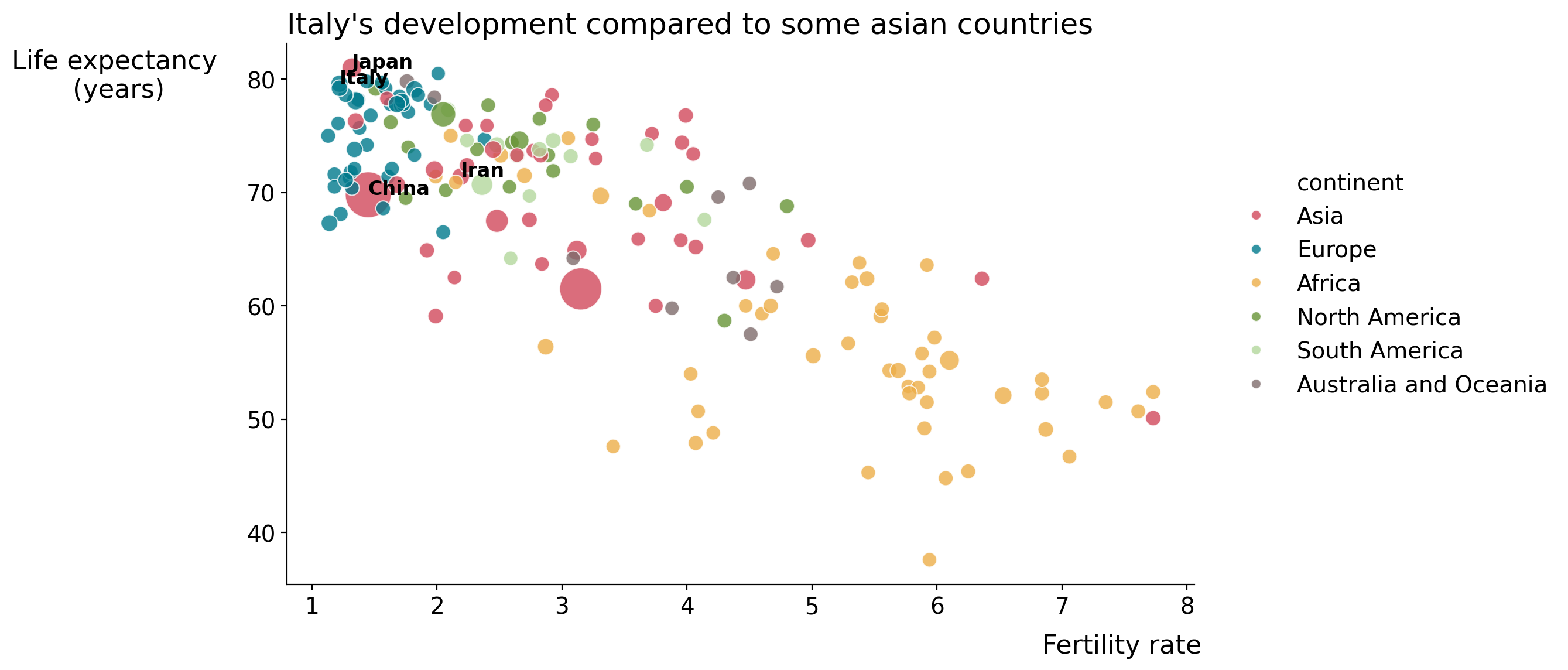
“I want to see how Italy is doing compared to some Asian Country”
Improve original palete v2#
BEST PRACTICE: ANNOTATE#
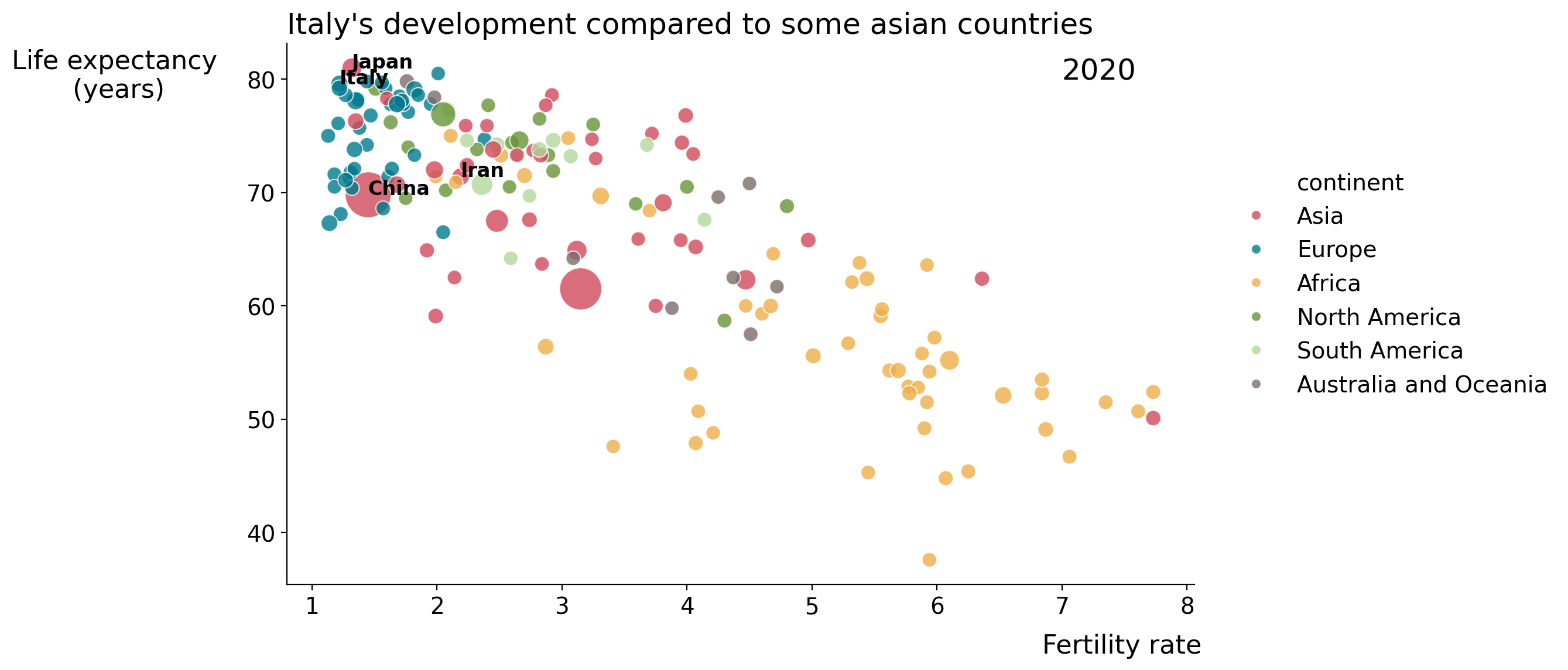
Add title#
Add current year for context#
BONUS BEST PRACTICE: Choose the right chart#
What do you want to show?
What is your message?
Who is your audience?
References#
Colin Ware, Information Visualization: Perception for Design
Stephen Few, Show Me the Numbers
Cole Nussbaumer Knaflic, Storytelling with Data
(Ware’s work is more detailed, the others pretty much just use the same summary)
There’s some interesting more recent work from people like Steve Palmer if you’re after papers to read.